The Shades of 2026: What Sherwin-Williams, Benjamin Moore, Behr & Farrell Calhoun Want You to Paint With
- thatpaintgirl
- Nov 10, 2025
- 5 min read
Here’s an overview of the 2026 “Color of the Year” picks from four major brands—what they chose, what they mean, and how you might use them.
We’ll cover:
Sherwin‑Williams
Benjamin Moore
Farrell Calhoun
Behr


Sherwin-Williams
What they picked;
Sherwin-Williams has named Universal Khaki SW 6150 as their 2026 Color of the Year.
They’ve paired it with their 2026 “Colormix Forecast: Anthology Volume 2” which includes four palettes (Frosted Tints, Sunbaked Hues, Restorative Darks and Foundational Neutrals).
“Universal Khaki” is described as a warm, defined neutral — “tailored & timeless,” offering strength in simplicity.
What it means;
Sherwin-Williams’ choice speaks to comfort, grounding, and the idea of “back to basics” in design. In a time when people may want more stability and fewer wild color shifts, a dependable neutral like Universal Khaki feels very strategic.
Their trend forecasting commentary suggests the “Foundational Neutrals” palette is about creating a stable base (clean whites, light taupes, silvery grays, khaki) while allowing richer tones and deeper contrasts as accents.
In other words: this isn’t about bright “show-off” colors so much as about well-considered backgrounds that let other design elements shine.
How to use it;
Use Universal Khaki on walls for an overall serene back-drop that complements many styles—from modern to transitional to casual.
Pair it with wood tones and organic textures: the warmth of the neutral will play nicely with natural materials.
Use it as a “neutral anchor” and inject accent colors from Sherwin’s 2026 forecast palettes — e.g., a lightly tinted pastel (from Frosted Tints) or a deeper bold (from Restorative Darks) for contrast.
Consider it for spaces where you don’t want the wall to demand attention, but rather allow art, furnishings, light and shadow to do the heavy lifting.


Benjamin Moore
What they picked;
Benjamin Moore’s 2026 Color of the Year is Silhouette AF‑655.
They describe it as a hue that “weaves luxurious burnt umber with delicate notes of charcoal.”
Their palette for 2026 (Color Trends 2026) accompanies this shade—offering complementary tones and mid-tones for layering.
What it means;
Silhouette signals a move away from ultra-bright or overtly bold colors toward something richer, deeper, more introspective. It’s less about “look at me” and more about “let’s settle in.”
It also reflects an interest in shades that don’t perfectly fit traditional color families — this is a brown/charcoal hybrid, something in-between. That kind of “complex neutral” feels very much of the moment.
For Benjamin Moore, the process behind selecting the color emphasizes global influences, cultural shifts, consumer behavior, and the idea of layering design elements thoughtfully.
How to use it;
Use Silhouette on feature walls or large surfaces when you want depth and richness. It’ll provide dramatic impact without being as “in your face” as a true jewel tone.
Consider using Silhouette for cabinetry, doors or accent elements—where the richness of the tone can show up nicely.
Layer with lighter tones for contrast (e.g., a soft neutral wall with Silhouette trim or built-ins) or with other trend palette colors (from their 2026 palette) to create interest.
Because of its charcoal undertones, light and context will affect how it appears—so test in your own lighting. This kind of hue thrives when lighting and texture are considered.


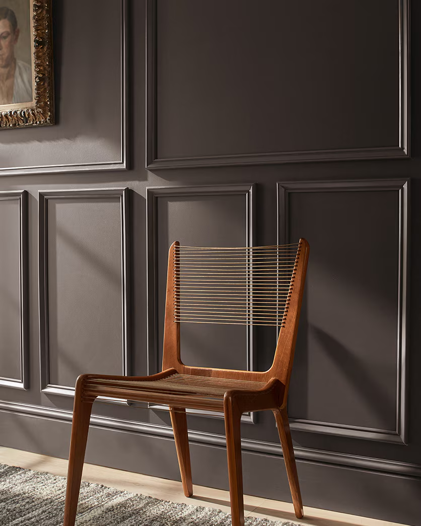
Farrell Calhoun
What they picked;
Farrell Calhoun has announced Wanderlust R099 as their 2026 Color of the Year.
Their website calls it “A Color of Discovery and Renewal.”
What it means;
As a regional brand (based in Memphis and the Mid-South region) they may not have the same global trend-machine as the largest brands, but their pick still reflects design sensibilities we’re seeing elsewhere—tones that evoke experience, reflection and calm recharge.
“Discovery and renewal” suggests this color is less about loud decor statements and more about inviting a kind of personal refresh. In a world where many people are seeking slow-down, wellness and intentional spaces, this aligns well.
Given that the full details (undertones, context, palette) are less widely published, it’s worth using their announcement as inspiration and then seeing how the color behaves in your space before committing.
How to use it;
Use Wanderlust for spaces where you want the feeling of reset, calm or fresh start—guest rooms, offices, quiet corners.
Because the name suggests “renewal,” pairing it with natural elements (wood, plants, light) could amplify that effect.
As always, test the color in your own light and with adjacent surfaces (floor, ceiling, furnishings) to see whether it leans more warm or cool in your context.


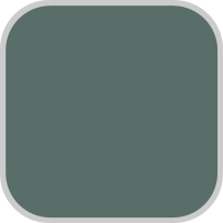


Behr
What they picked;
Hidden Gem (N430‑6A) is Behr’s 2026 Color of the Year.
They describe it as a “smoky jade” – a blend of blue and green—a color that “uncovers exceptional beauty in every space.”
In coverage, it’s referred to as a “new neutral” — not flat beige but something richer, more layered.
What it means;
Hidden Gem reflects the continuing dominance of green‐based hues in interiors, but with a twist—this isn’t sage or olive, it’s a smoky jade (blue-green) which gives it a slightly more sophisticated, moody feel than typical “greens of the past.”
By positioning it as a neutral, Behr is essentially saying: if you already have a base neutral palette, this could be your next step toward adding color without going “full” colorful. It’s color… but understated.
It also aligns with broader trends of nature-inspired tones, blends of old & new, and a desire for spaces that feel both restful and subtly expressive.
How to use it;
Hidden Gem is excellent for accent walls, cabinetry, islands in kitchens, or even ceiling treatments when you want something dramatic yet grounded.
Because it changes with light (the blue/green interplay), play with both natural and artificial light to see how it shifts in your room.
Pair it with warmer neutrals (cream, beige, light wood) to soften its moodiness, or with crisp metallics (brass, copper) for contrast.
Use it in rooms you want to feel calm, introspective, maybe a little adventurous—but not over the top.
Putting it all together;
Here are a few comparative thoughts to help you choose or be inspired:
Tone/Feel: Sherwin’s Universal Khaki is the most “classic neutral”, Benjamin Moore’s Silhouette leans richer and deeper, Behr’s Hidden Gem offers a subtle color twist on neutral, and Farrell Calhoun’s Wanderlust suggests renewal and maybe more personality.
Color families: Neutral (khaki) vs deep brown/charcoal hybrid vs blue-green vs whatever tone Wanderlust is (you’ll want to test and verify).
Usage style: If you want safe, broad adaptability, Sherwin might win. If you’re ready for depth and sophistication, BM. If you want a subtle shift or an accent that isn’t loud, Behr. If you’re doing a refresh, local/regional vibe, maybe Farrell Calhoun.
Trend context: Many designers are moving away from flat, “safe” neutrals toward colors that have more depth, more layers, more emotional resonance. The 2026 picks reflect that. They aren’t screaming “neon!” but they are saying “we can be calm, thoughtful, but not boring.”
Final Thoughts & Tips for Homeowners
Always test the color in your own space: paint large swatches, observe them at different times of day, check how furnishings and lighting change their appearance.
Think about what you already have: flooring, cabinetry, trims, hardware, fabrics. The new color should complement, not clash.
Consider accent vs whole room: Some of these colors may read differently when used on all walls versus a single wall.
Use the 2026 Color of the Year as a launching point, not a limit: each brand also offers palettes to complement the main shade.
Don’t feel pressured to adopt “the” color just because it’s trending. The best color for a space is the one *you*’ll live with and love day in and day out.


Comments